Normal button android look
very simple.
We want round corner button,
with border, color as we choose. Let create a xml file name back.xml in folder drawable.
<shape xmlns:android="http://schemas.android.com/apk/res/android"
android:shape="rectangle">
<solid android:color="#E6E6FA"/>
<stroke
android:width="1dip"
android:color="#4b5320" />
<corners android:radius="20dp"/>
</shape>
If don’t like border, remove
the stroke, if want thin border, reduce the
width value.
Add this line in file xml.
android:background="@drawable/back"
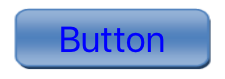
Button now look like this.
If we want a round button,
set width and height=50dp, change corner in
file back.xml to
<corners android:radius="25dp"/>
If we want button turn green
when clicked, create a file name back2.xml in
folder drawable.
<?xml version="1.0"
encoding="utf-8"?>
<selector xmlns:android="http://schemas.android.com/apk/res/android"
>
<item android:state_pressed="true"
>
<shape
android:shape="rectangle" >
<corners
android:radius="20dip" />
<stroke android:width="0.5dip"
android:color="#6699cc" />
<gradient android:angle="-90"
android:startColor="#66ff00" android:endColor="#bcd4e6" />
</shape>
</item>
<item android:state_focused="true">
<shape
android:shape="rectangle" >
<corners
android:radius="20dip" />
<stroke android:width="0.5dip"
android:color="#6699cc" />
<solid
android:color="#afeeee"/>
</shape>
</item>
<item >
<shape android:shape="rectangle" >
<corners android:radius="20dip"
/>
<stroke android:width="0.5dip"
android:color="#6699cc" />
<gradient android:angle="-90"
android:startColor="#E6E6FA" android:endColor="#e6e8fa"
/>
</shape>
</item>
</selector>
Set background of button to
back2, when you click button, it will look like this.
When put button above
another view like imageView, we will want it transparent. Add this line in to
xml file.
android:background="@android:color/transparent"
To make 3D button, create an image like
this, you can do it in word art.
Copy image in to
drawable folder, set background for button.
android:background="@drawable/image"
If you want button with blur color, create a file name bu.xml in drawable.
<?xml version="1.0" encoding="UTF-8"?>
<shape xmlns:android="http://schemas.android.com/apk/res/android"
android:shape="rectangle" >
<stroke
android:width="2dp"
android:color="#FFFFFFFF" />
<gradient
android:angle="225"
android:endColor="#DD2ECCFA"
android:startColor="#DD000000" />
<corners
android:bottomLeftRadius="7dp"
android:bottomRightRadius="7dp"
android:topLeftRadius="7dp"
android:topRightRadius="7dp" />
</shape>
And set background for button.
android:background="@drawable/bu"
Button now look like this.
If you change file bu.xml to this.
<?xml version="1.0" encoding="utf-8"?>
<layer-listxmlns:android="http://schemas.android.com/apk/res/android">
<item>
<shape>
<corners
android:radius="5dp" />
<gradient
android:angle="270"
android:startColor="#8BB6F5"
android:centerColor="#DFE8F9"
android:endColor="#3F83E9"
android:centerY="0.2"
android:type="linear"
/>
</shape>
</item>
</layer-list>
Button now look like this.


